It’s worthwhile to talk about how insights professionals can draw conclusions from the research they conduct (or data they analyze). To be fair though, the example I’m going to use below (of how not to draw conclusions) likely was written by journalists and editors at CBS News.
After the State of the Union address Tuesday, CBS News conducted a snap poll of viewers (link). A good portion of the report is yeomen’s work in talking about the data and describing it to readers. As an insights professional though, I have to take issue with how the poll results are framed.
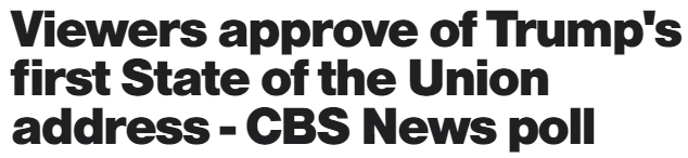
Here is what CBS’s headline says:
Politics aside, there are proper conclusions to draw and improper ones from any data collected in research. Properly drawn conclusions have direct lines from the data and clear lines of reasoning that support them. Ideally, a single conclusion is drawn from multiple data points that interlock and ladder up to a single idea. A single data point can support multiple conclusions when taken together with other, different sets of data points.
Then, there are improper conclusions (which unfortunately we see in the CBS News article). You get several paragraphs in (burying the lede as it’s called) before you get to what is really happening:
In the latest CBS national poll released earlier this month, 24 percent of Americans identified themselves as Republicans. Among those who watched tonight’s address, that percentage was 42 percent, bolstering the overall approval of the address.
The headline (which is effectively an executive summary) simply cannot be justified by this data. “Viewers” contains little information about who was watching and (in my opinion) carries the implication that it was a representative sample of the US population across all relevant groups, but the sample is non-representative (skewing heavily Republican).
Later, the article mentions half of the 33% of independents who watched the State of the Union support Donald Trump, effectively making the sample nearly 60% Republican or Republican-leaners. Moreover, the article later provides a quick note that the Democrats tuning in didn’t like the speech.
A more accurate headline (or summary statement) may have read: Republicans Approve of Trump’s First State of the Union Address—though this lacks punch (“tell me something I don’t know…”). Something punchier (and possibly more clickable) might be: Trump’s first State of the Union polarizes viewers. To understand more, a reader then would have to dive in.
I have a few other issues with the article as well, specifically where the writer says that viewers increased in the opinion that Trump’s policies will help them “a lot.” Numerically, that is correct: it went from 51% to 54% (of viewers). But, this is research and relies on samples of the population. It’s not enough to rely on a mere numeric uptick (or decrement): you have to support words like “increase” or “decrease” with statistical significance. In business, you can use an 80% confidence interval (basically, you have a 1 in 5 chance of being wrong). However, this is a poll and attempting to model the opinions of population, you need to be more stringent…a 95% CI is far more defensible. And unfortunately, a 3-point increase even with 1000+ sample does not meet a 95% CI.
The relevance to the insights profession may be less clear at this point (i.e.., why should you care about a poll on a political figure if you’re trying to summarize your quarterly brand tracking insights).
There are a couple things here to keep in mind as you go to writing your reports on your work:
- Like a news article, you have to grab your stakeholders’ attention. You need to communicate the insights and implications of your work quickly and (this is important) accurately. Are your insights and implications supported by your underlying data? Is there anything that would contradict them?
- As you release your reports into the wild, non-researchers (i.e., people not steeped in translating data to insights to implications) will be using them. Like a game of telephone, what you say in your report can ultimately be misinterpreted by others as it diffuses throughout the business. To a large extent, we are responsible for maintaining the integrity of our work products and how they are used (or marketed to functional groups).
I know I’ve had difficulties taking data, drawing insights up from them, and then applying them to the business, especially on large complex projects where you can examine data in multiple ways. Our credibility as professionals can be at stake; we want our stakeholders to trust us. But, when we go beyond what is in our data, we could be leading them down a primrose path (and negatively impacting the relationship).